
In today’s fast-paced world, attention spans online are almost non-existent. And this is no exception when it comes to business websites. Businesses and brands have a very limited amount of time (less than a second!) to catch attention and make a good impression with their websites.

So in less than a second, users decide whether they want to stay on your page or leave and look elsewhere. This means you need to do whatever possible to make sure you give a positive first impression. And design can have a huge impact.

So without further ado, let’s go over some top website design mistakes you should avoid to ensure your website holds your viewers’ attention and you get more customers.
10 Top Website Design Mistakes
- Unclear Navigation
- Blurry/Irrelevant Images
- Too Cluttered
- Not Responsive
- Too Many Annoying Popups or Ads
- Unattractive CTAs
- Missing Contact Info
- Too Unconventional
- Poor Loading Speed
- Poor Contrast
1. Unclear Navigation
This is one of the most common website design mistakes. When we say navigation, we mean your menu and how easily users can move around your website or ‘navigate’ it. You want to make it easy for people to find what they are looking for. The easier the better. The last thing you want is to confuse new viewers on your site.
How?
There are a couple of standard practices to stick to. For example, website menus are usually across the top of a site or along one of the sides. People are used to this and look for it. Opting out of this standard can make your site difficult to use.
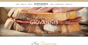
2. Blurry/Irrelevant Images
Blurry images look unprofessional. It’s as simple as that. A website for your business is supposed to build credibility, and having blurry images can render all of your efforts mute. But that doesn’t mean you should use high-quality images that have nothing to do with your business. Your images also need to be relevant to what you do.
Your images and visuals are a chance to stand out and entice viewers to look for more. Whether you want to include an engaging video you have or some images of your physical location or employees, make sure they’re high quality.
P.S. We do recommend using real images when possible, but if you’re looking for some quality stock images, here are a couple of sites you can look on:
3. Too Cluttered
Less is more. This is especially true with websites, think of Google for example. Google’s interface is simple and clean. Now don’t get us wrong, Google’s layout may be a bit too simple for your business’s website and you probably have more information to include than just your logo and a search bar, but in web design, you can make a greater impact by including white space.
What is white space?
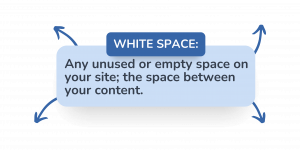
Remember, white space does not have to be white!
So the key here is to ensure your website is not too crowded. This actually makes your content easier to consume and your design pleasing to the eye. Just remember, not every corner of your site has to have an image or block of text. Keep it simple to avoid one of the most unattractive website design mistakes.
4. Not Responsive
Alright, we arrived at the big one. There are so many reasons why you need to have a responsive website design, but first, what is a responsive website?
Having a responsive design means that your site will automatically adjust for different devices and screen sizes. So no matter if someone sees your site from a desktop, a cellphone, or a tablet, it will be optimized.

Nowadays, people browse and discover businesses from many different devices, and if your site doesn’t look good or isn’t user-friendly on their preferred device, they’ll most likely BOUNCE. And not just that:
Almost 60% of people won’t recommend a business if its site doesn’t look good on mobile, so if you want referrals, don’t make this website design mistake!
And since websites that appeal to mobile viewers are more user-friendly, Google prioritizes responsive website designs.
5. Too Many Annoying Popups/Ads
Popup advertising can be very effective, but there’s a major difference between being effective and annoying. One popup asking your viewers to subscribe to your email list should be ok, but if after that, you have a chatbot making noises, and 5 more popups, people are most likely going to get annoyed and exit your site. So try to keep the popup ads to a minimum to avoid one of the most frustrating website design mistakes.
6. Unattractive CTAs
Having a captivating CALL TO ACTION is a critical element of any great website design. CTAs let your viewers know what to do next and guide them to take a desired action. Let’s say you own a restaurant, and you want your website viewers to order online, you need a clear CTA to guide them to take that action. It’s also important to make sure your CTAs stand out, having your CTA button a different color than your background color is a great way to do this. Another great way to increase your conversions is to entice your audience to click by including well-written copy surrounding your CTA. Take a look at the example below:

7. Missing Contact Info
The last thing you want is for someone to visit your website, like what they see, yet have no way of contacting you or having their preferred method of contact missing. It’s important to give your viewers options, so including your phone number, email, and even your social media links can help make sure you’re not missing out on any prospects. Another common mistake is that your contact info is difficult to find. Most websites have their contact info on a separate page or listed in the footer, this makes it easy for your customers to get in touch with you.
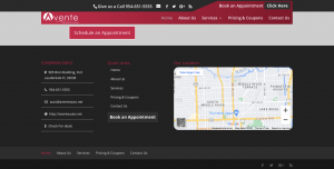
So include a contact page or clearly show your contact info in your footer to avoid one of the most crucial website design mistakes.
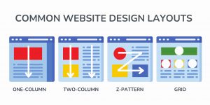
8. Too Unconventional
People like things they are familiar with. So you want your website to be unique, but not TOO unique. What we mean is that there are standard practices in web design that people look for and if your site doesn’t follow suit, viewers may get confused.
A great example is what we mentioned earlier about the placement of your website’s navigational menu; it is common to have a website menu across the top of the site or along one of the sides. It’s become so common that people specifically look for menus in these places. If you choose to have your menu elsewhere, it can make your site confusing and difficult to use.
So what can you do?
You can follow a common layout (see examples below) and stick to standard design practices while using your content and visuals to stand out and make your site unique.
9. Poor Loading Speed
This is another huge one, and it’s surprising how quickly users expect a website to load nowadays.

So it goes without saying that your website needs to load quickly. A couple of things you can do is make sure your image file sizes are not too big (It’s best to try to keep them under 400KB) and that you don’t have any unnecessary plugins. You can also check your website speed performance here.
If users are exiting your site because of a slow loading speed, this doesn’t help your SEO efforts. High bounce rates can indicate to Google and other search engines that your site is not relevant or user-friendly, and your ranking can be penalized. So try to get your website to load in under 3 seconds to avoid one of the most important website design mistakes.
10. Poor Contrast
Having a deep visual contrast on your website makes your text easier to read and overall your site more appealing. If users have to squint just to read your text, there’s a big mistake. To make sure your site has a high-contrast design, it helps to use opposing colors on the color wheel. Or you can stick to black and white.
Take a look at what we mean with the example below. The deep blue and bright yellow are opposing colors on the color wheel and have high contrast. On the other hand, the blue with the purple are right next to each other on the color wheel and have low contrast.

One very important thing to keep in mind: You want to stick to your brand. So just because two colors may work together, doesn’t mean you should use them. You also need to stick to your brand messaging and identity.
Let us design your website!
Was that a lot to take in? Do you want to make sure you’re not making these common website design mistakes? We’ve helped thousands of small business owners design beautiful and optimized websites to help them grow online. Learn more about our website add-on services by giving us a call or scheduling a FREE DEMO with our team.
888-884-6050
You can also check out some of our sample sites below or see them all here.